


What is a brand?
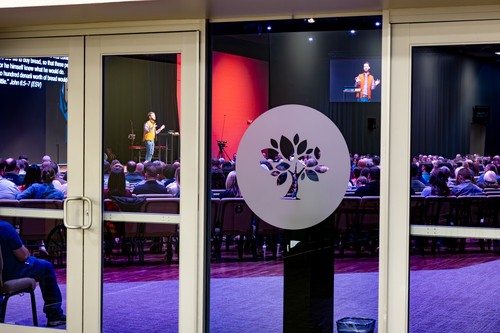
While the word “brand” can feel a little out of place in a church context, it simply refers to the way people recognize and experience who we are. Our brand is the visual expression of The Orchard that ultimately shapes the associations people make with our name/logo and the feeling they carry when they walk through our doors.
Why is a consistent brand important?
A consistent brand is important because it communicates intentionality in everything we do. It shows that we are thoughtful, well-planned, and professional in how we present ourselves, which builds trust and credibility. More than that, consistency reflects a genuine care for our people by creating a clear, welcoming, and reliable experience that helps others feel confident in who we are and what we’re about. While there will be obvious differences in Orchard Kids, OSM, Orchard Worship, Orchard Weekly, etc. we want the overall feel, intention, and language to be consistent.
The Orchard Brand
- On trend, but not "trendy"
- Clean- Classic
- Consistent
- Mission-driven
- Intentional

The Orchard Mission Statement
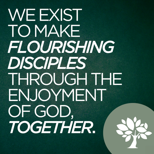
We exist to make flourishing disciples through the enjoyment of God, together.
The Orchard Vision
Enjoy God. Share Life. Make Disciples.
Read more about Orchard's Vision.
Our logo is the primary identifier for our brand. When people see the circled tree, they should automatically associate that with The Orchard Church.
Our primary logo is the "Orchard green" circle with a white tree.

Our secondary logo is a black circle with a white tree.

Logo in brand colors:


The only exception to using the tree logo is OSM:

The tree logo can be used alone, or with The Orchard name or ministry name next to it. When using words with the logo, be sure that ALL LETTERS ARE UPPERCASE and that ministry names are stacked with "ORCHARD" in standard font and the ministry area in BOLD.


GOTHAM
Gotham is our primary typeface. Gotham Book is most frequently used, although you can Bold, Italicize and Underline multiple versions of this typeface.
Gotham is our primary typeface. Gotham Book is most frequently used, although you can Bold, Italicize and Underline multiple versions of this typeface.
SENTINEL
Sentinel is our secondary font. It is always italicized, but you can Bold and Underline it.

Graphics are more than just visuals, they are a way we communicate with intentionality across all platforms. Graphics play a role in Sunday gatherings, announcements, social media, emails, print materials, and signage, creating a unified experience both online and in person.
Graphics should capture the look/feel of an event, be age-appropriate (Kids, OSM, etc.), and be consistent across each event.
Graphics should capture the look/feel of an event, be age-appropriate (Kids, OSM, etc.), and be consistent across each event.
When promoting an event, it is good to be consistent in the look/feel of the graphics, but it is also good to incorporate pictures when possible to give a more immersive experience for the viewer.
SCREEN DIMENSIONS:
When creating a graphic for a screen/slide, the dimensions should always be 1920px x 1080px
When creating a graphic for a screen/slide, the dimensions should always be 1920px x 1080px

We should approach videos and reels with intentionality, recognizing that every video has a purpose and a specific audience. Before creating anything, we need to consider who we are trying to reach. Whether it’s first-time guests, church members, volunteers, parents, or a specific ministry group, we want to tailor the tone, language, and style to connect with them.
Next, we focus on the message we are trying to convey. Each video should have a clear and singular purpose, whether it’s inviting someone to an event, sharing a story of life change, communicating an announcement, or casting vision. Clarity is key - people should quickly understand what the video is about and what their next step is.
Finally, we consider the amount of time. Attention spans are limited, so videos should be as concise as possible while still being effective. Short, engaging videos work best for social media and announcements, while longer formats can be used more intentionally for storytelling or teaching. Every second should feel purposeful.
Ultimately, our goal is to create videos that are clear, engaging, and meaningful - helping people connect, understand, and take their next step.

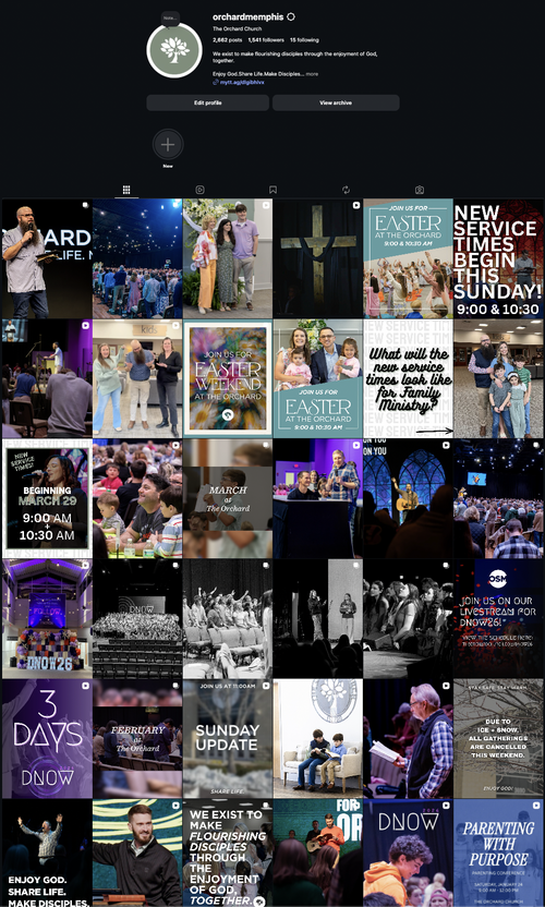
Social Media - Posts and Reels
QR Codes
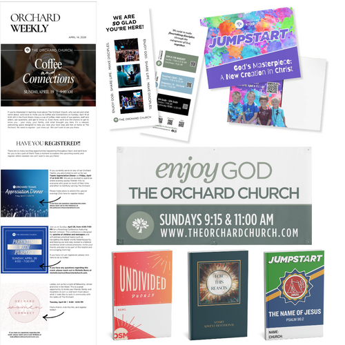
Post Cards
Letterhead
Banners
Website
Booklets (DNOW, Jumpstart, Advent, etc.)
Orchard Weekly
Emails (Hospitality, Orchard Women, Groups, Kids Newsletter, etc.)
QR Codes
Post Cards
Letterhead
Banners
Website
Booklets (DNOW, Jumpstart, Advent, etc.)
Orchard Weekly
Emails (Hospitality, Orchard Women, Groups, Kids Newsletter, etc.)
Note about QR Codes: QR codes are most effective on printed materials or slides where people can easily scan them with their phones. They should not be used in emails or on social media, since most people are already viewing those on their phones and are unable to scan the code. For these settings it is must more effective to use a clickable link.

Social media is one of the primary ways we communicate with and reach people both inside and outside the church. Because of that, we approach it with intentionality—always considering the audience we are trying to engage. Whether we’re speaking to parents, students, or potential visitors, our tone, content, and messaging should be clear, relevant, and inviting to each group.
Keep in mind that people are not coming to our social media to find out what's coming up. They aren't looking for announcements. They are coming to see what we are about - What does worship look/sound like? What does Jumpstart look like? What is DNOW?
The goal of our social media is not just to share information, but to create connection and clarity. We want to highlight what God is doing in and through our church, celebrate stories of life change, keep people informed about what’s coming up, and help others take their next step. At the same time, we want to present a consistent and welcoming picture of who we are, so that someone encountering The Orchard online gets a true sense of our heart, our community, and our mission.
Keep in mind that people are not coming to our social media to find out what's coming up. They aren't looking for announcements. They are coming to see what we are about - What does worship look/sound like? What does Jumpstart look like? What is DNOW?
Before publishing a post, ask yourself the following questions:
Is this intentional?
Am I posting with a clear purpose, or just posting to fill space?
Who is this for?
Is this geared toward the specific audience I'm trying to reach (parents, students, visitors, members, etc.)?
Is the message clear?
Will someone quickly understand what this is about and why it matters?
Does this reflect who we are?
Is this aligned with The Orchard's voice, value and overall brand?
Is it engaging?
Would this catch someone’s attention and encourage them to interact or respond?
Is it visually consistent?
Does the graphic, video, or photo match our branding and quality standards?
Is this the right timing and/or platform?
Does this make sense to post now, and is this the best channel for it?
SOCIAL MEDIA DIMENSIONS
POST: All social media posts should be done in a 4:5 ratio (1080px x 1350px)
VIDEO: All social media videos/reels should be done in 1080px x 1920px
COVER PHOTO: All videos/reels should have a cover photo that is 1080px x 1920px with the focal point fitting into the 4:5 ratio
POST: All social media posts should be done in a 4:5 ratio (1080px x 1350px)
VIDEO: All social media videos/reels should be done in 1080px x 1920px
COVER PHOTO: All videos/reels should have a cover photo that is 1080px x 1920px with the focal point fitting into the 4:5 ratio

Anything that is church-wide (will be seen in lobby, church-wide email, membership-specific communications, etc.) needs to be approved by the Communications Director.
If you have a video or social media reel that is ministry specific (OSM and Kids), it must be approved by the Family Pastor before posting!
If you have a video or social media reel that is ministry specific (OSM and Kids), it must be approved by the Family Pastor before posting!